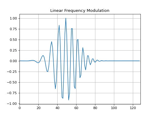
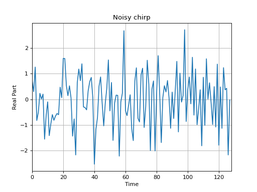
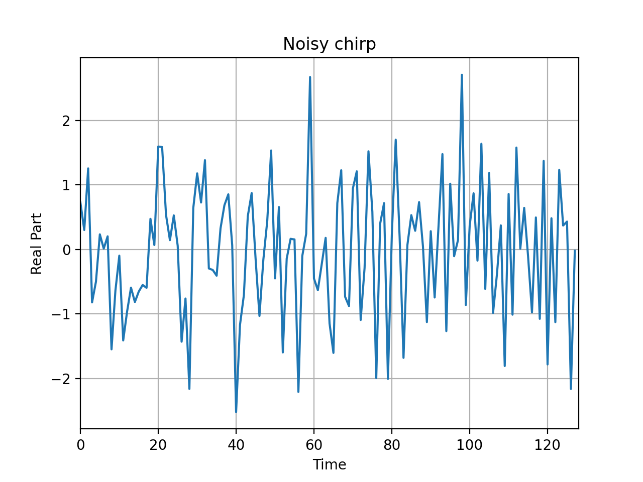
Let us consider first a signal with constant amplitude, and with a linear frequency modulation - i.e. a signal such that
its amplitude remains constant, but frequency increases linearly with time - varying from 0 to 0.5 in
normalized frequency (ratio of the frequency in Hertz to the sampling frequency, with respect to the Shannon sampling
theorem). This signal is called a chirp, and as its frequency content is varying with time, it is a non-stationary
signal. To obtain such a signal, we can use the function tftb.generators.fmlin, which generates a linear frequency
modulation.
>>> fromtftb.generatorsimportamgauss,fmlin>>> importmatplotlib.pyplotasplt>>> importnumpyasnp>>> z=amgauss(128,50,40)*fmlin(128,0.05,0.3,50)[0]>>> plt.plot(np.real(z))>>> plt.title("Linear Frequency Modulation")>>> plt.show()
From this time-domain representation, it is difficult to say what kind of modulation is contained in this signal:
what are the initial and final frequencies, is it a linear, parabolic, hyperbolic… frequency modulation?
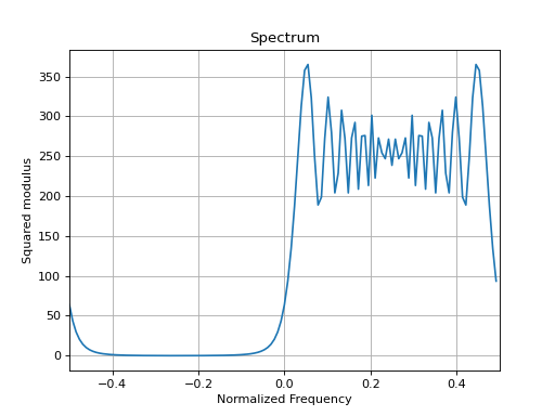
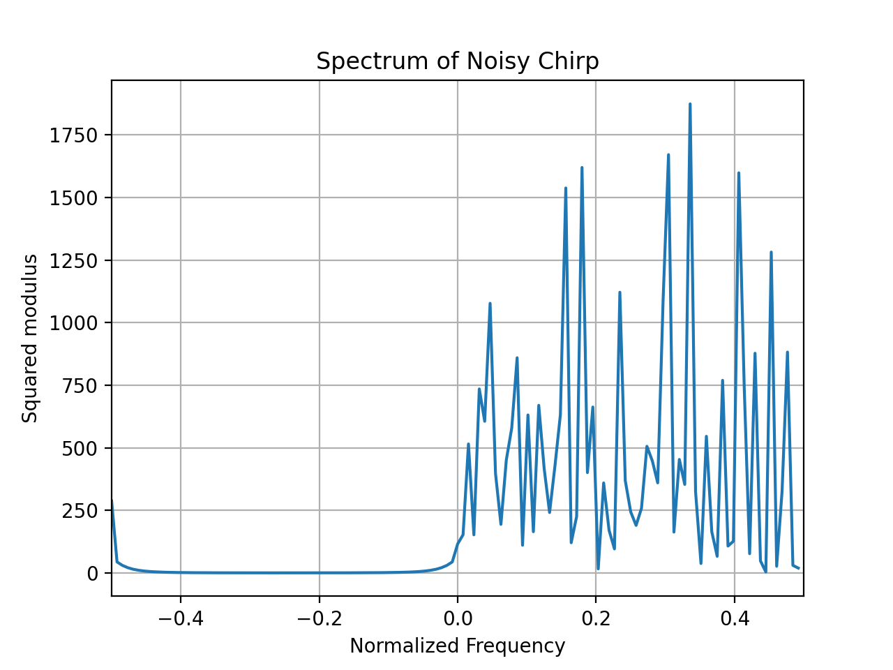
If we now consider the energy spectrum of the signal z by squaring the modulus of its Fourier transform
(using the numpy.fft.fft function):
we still can not say, from this plot, anything about the evolution in time of the frequency content. This is due to the
fact that the Fourier transform is a decomposition on complex exponentials, which are of infinite duration and
completely unlocalized in time. Time information is in fact encoded in the phase of the Fourier transform
(which is simply ignored by the energy spectrum), but their interpretation is not straightforward and their direct
extraction is faced with a number of difficulties such as phase unwrapping. In order to have a more informative
description of such signals, it would be better to directly represent their frequency content while still keeping the
time description parameter. This is precisely the aim of time-frequency analysis. To illustrate this, let us try the
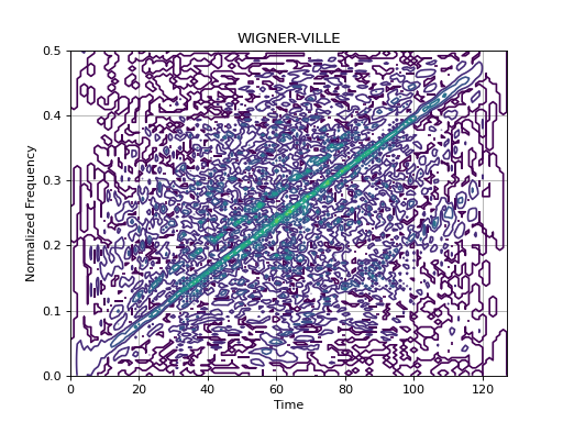
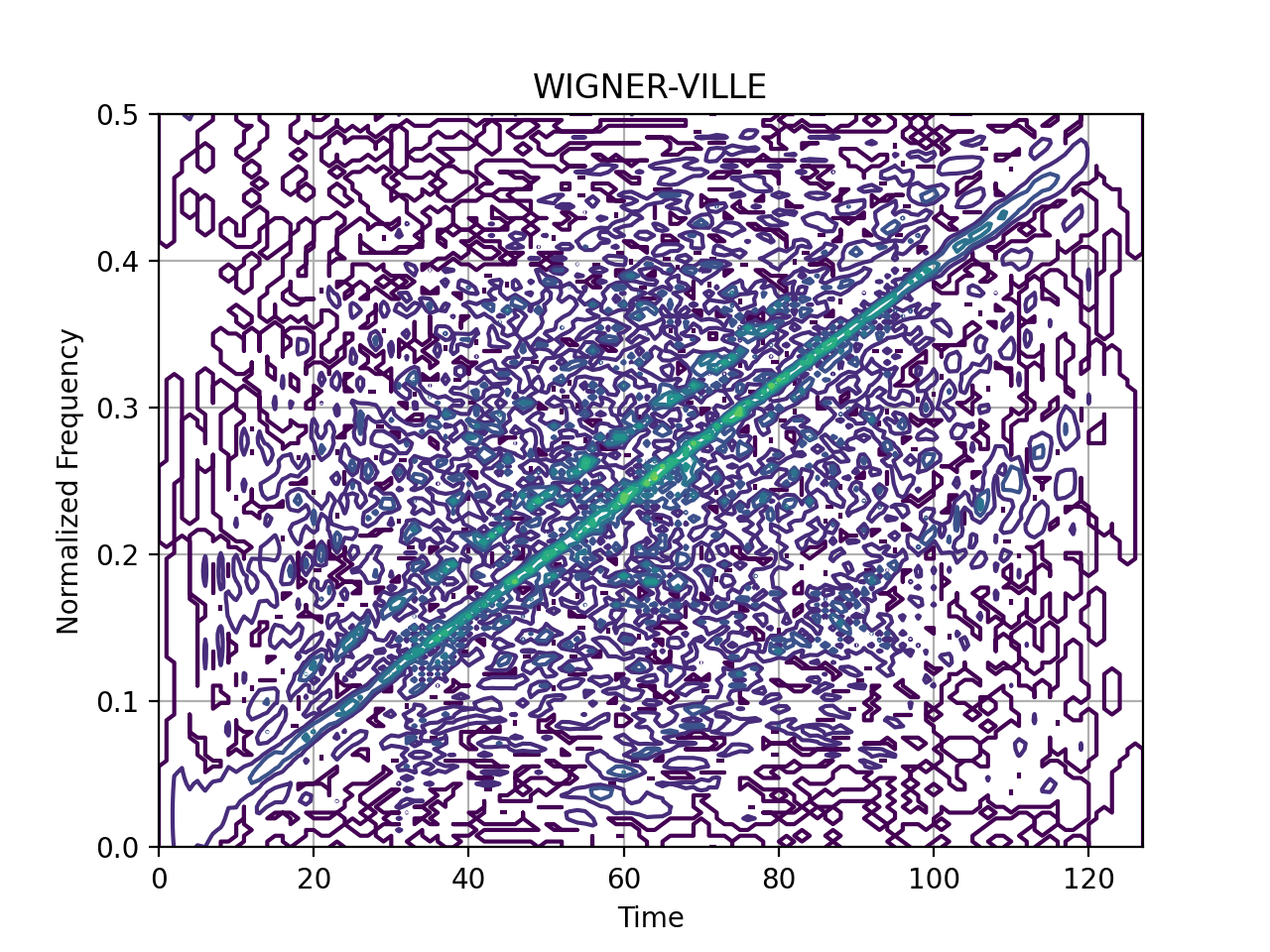
Wigner-Ville distribution on this signal.
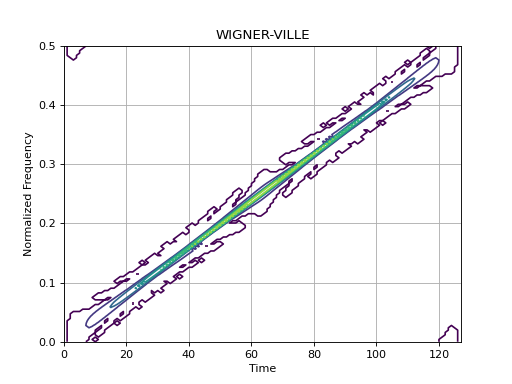
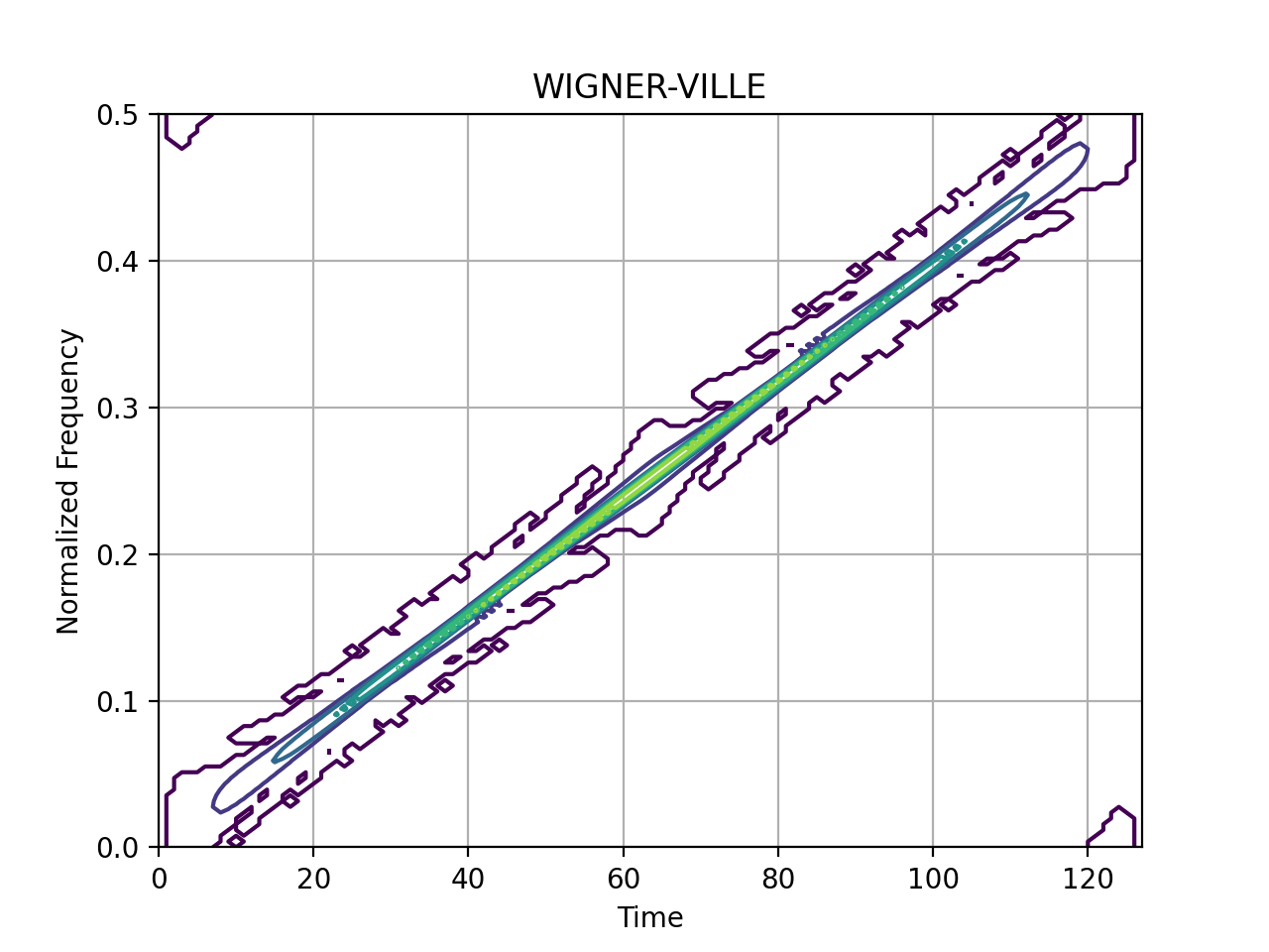
it is worse than before to interpret these plots. On the other hand, the Wigner-Ville distribution still show quite
clearly the linear progression of the frequency with time.


